Sunbound
Packaging & Brand System
Opening piece
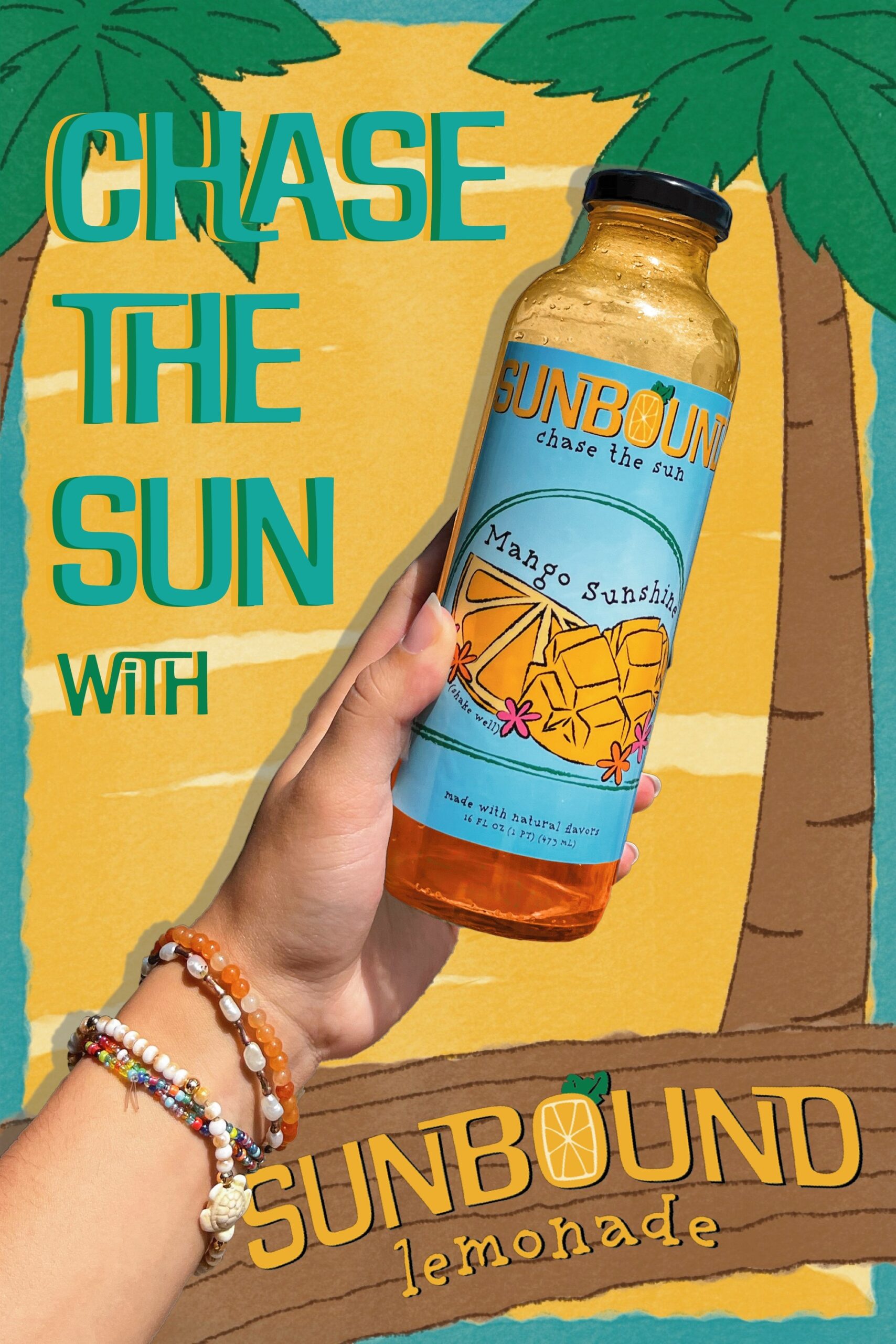
Chase the Sun poster
- Role
- Concept, wordmark, illustration, hand-lettering, label layout, poster and point-of-sale pieces
- Disciplines
- Brand identity, packaging, illustration, point of sale
- Deliverables
- Wordmark · three flavour labels with back panels · Chase the Sun poster · window and floor displays · counter display and dieline
The brief
Create a product concept, logo, brand identity, product line and marketplace display options. Gabriella created a lemonade brand called Sunbound, with three drink labels by flavour and a set of in-store displays.
The concept
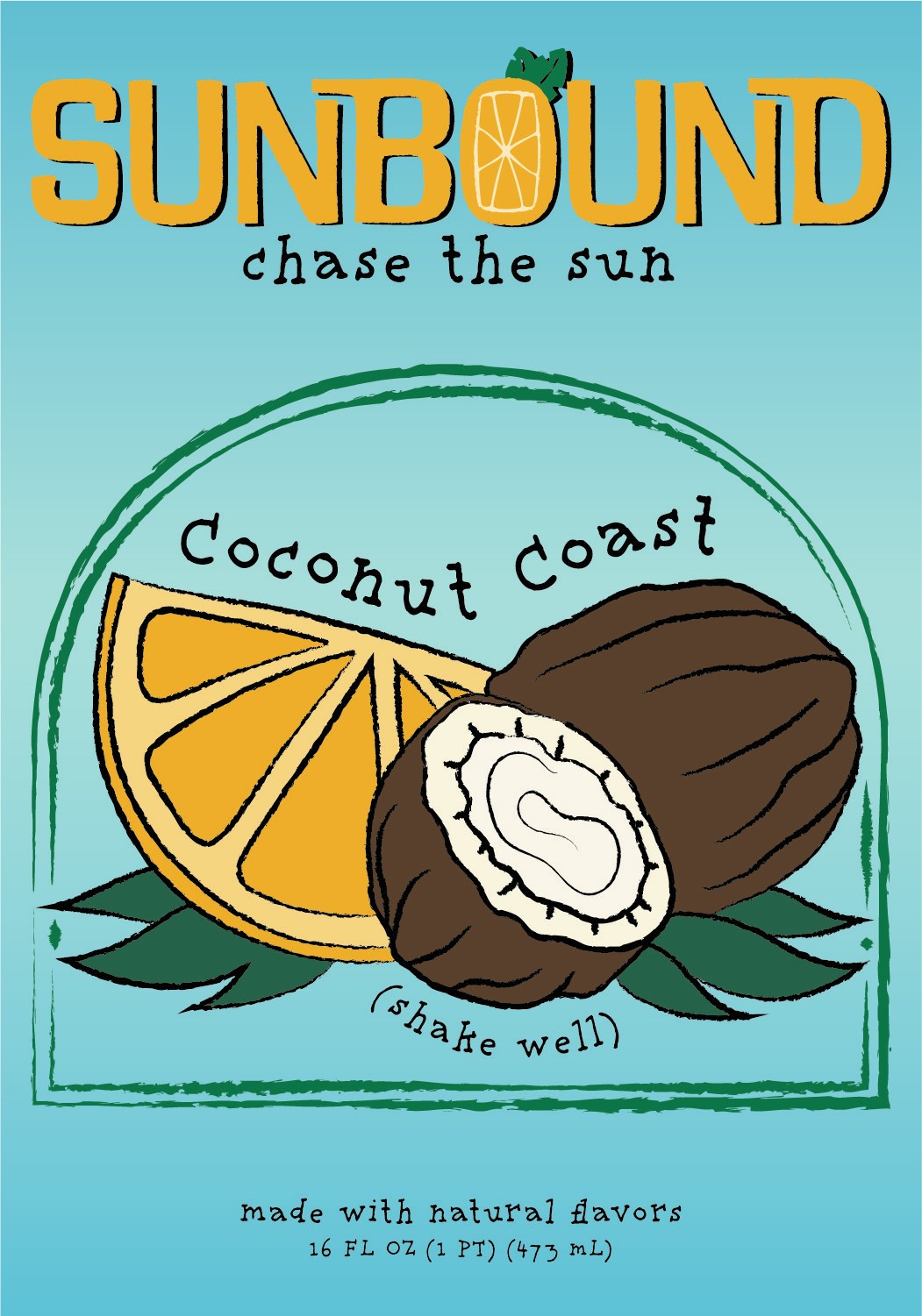
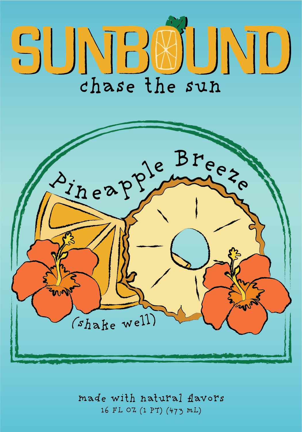
The system holds one illustrated label structure across three flavour variants — Coconut Coast, Pineapple Breeze and Mango Sunshine — changing the fruit illustration while the wordmark, the “chase the sun” script and the back-panel layout stay fixed. The poster, floor decal and counter display reuse the same hand-drawn vocabulary at larger scale.
The visual system
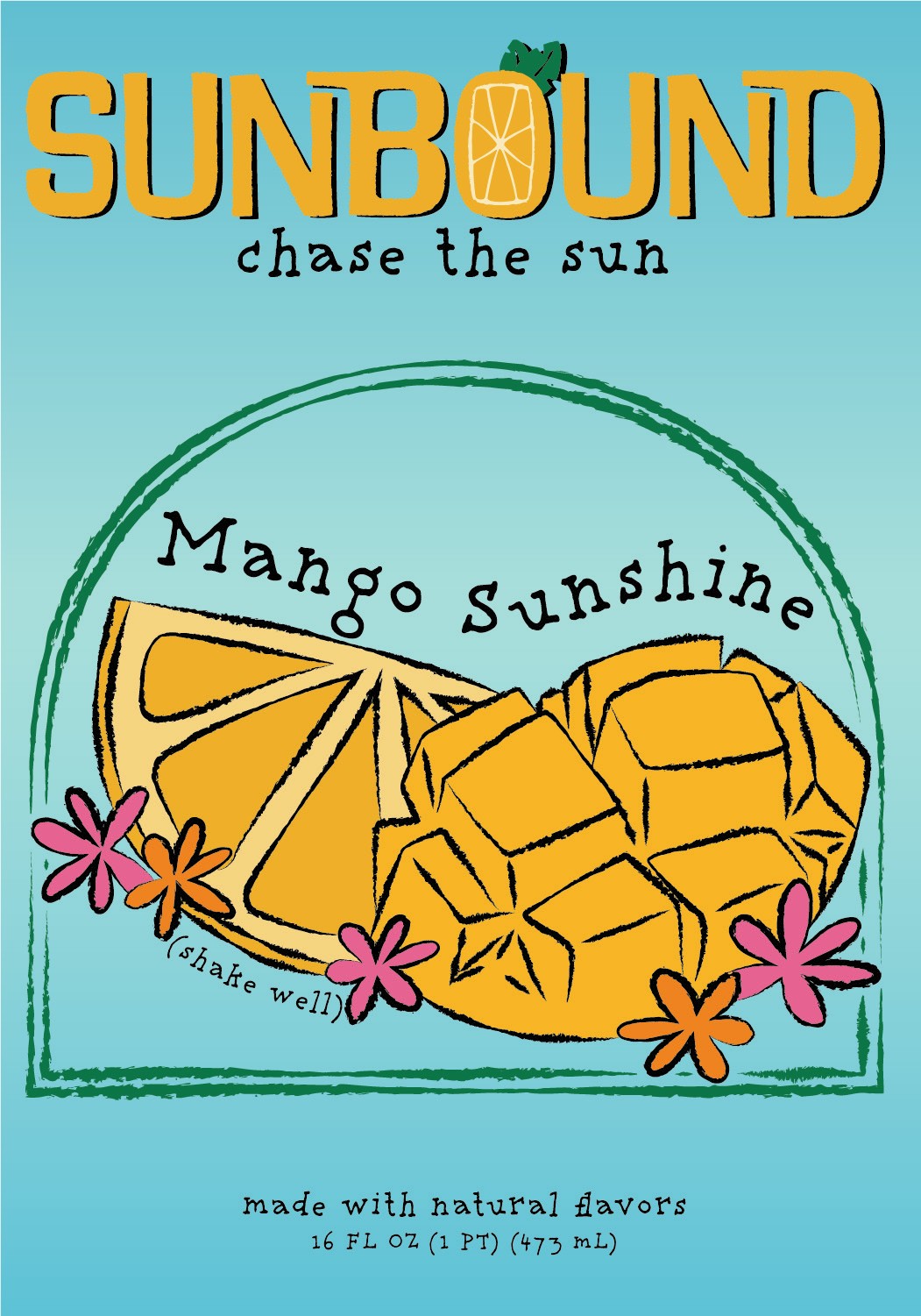
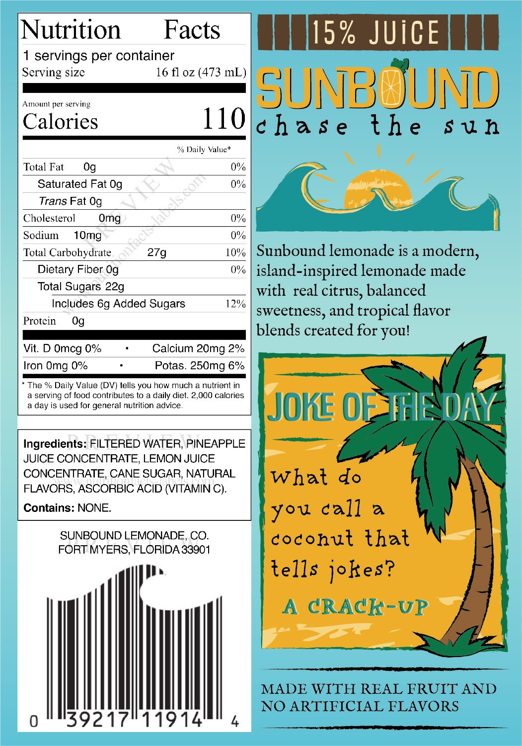
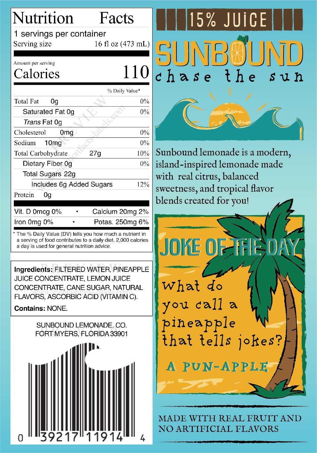
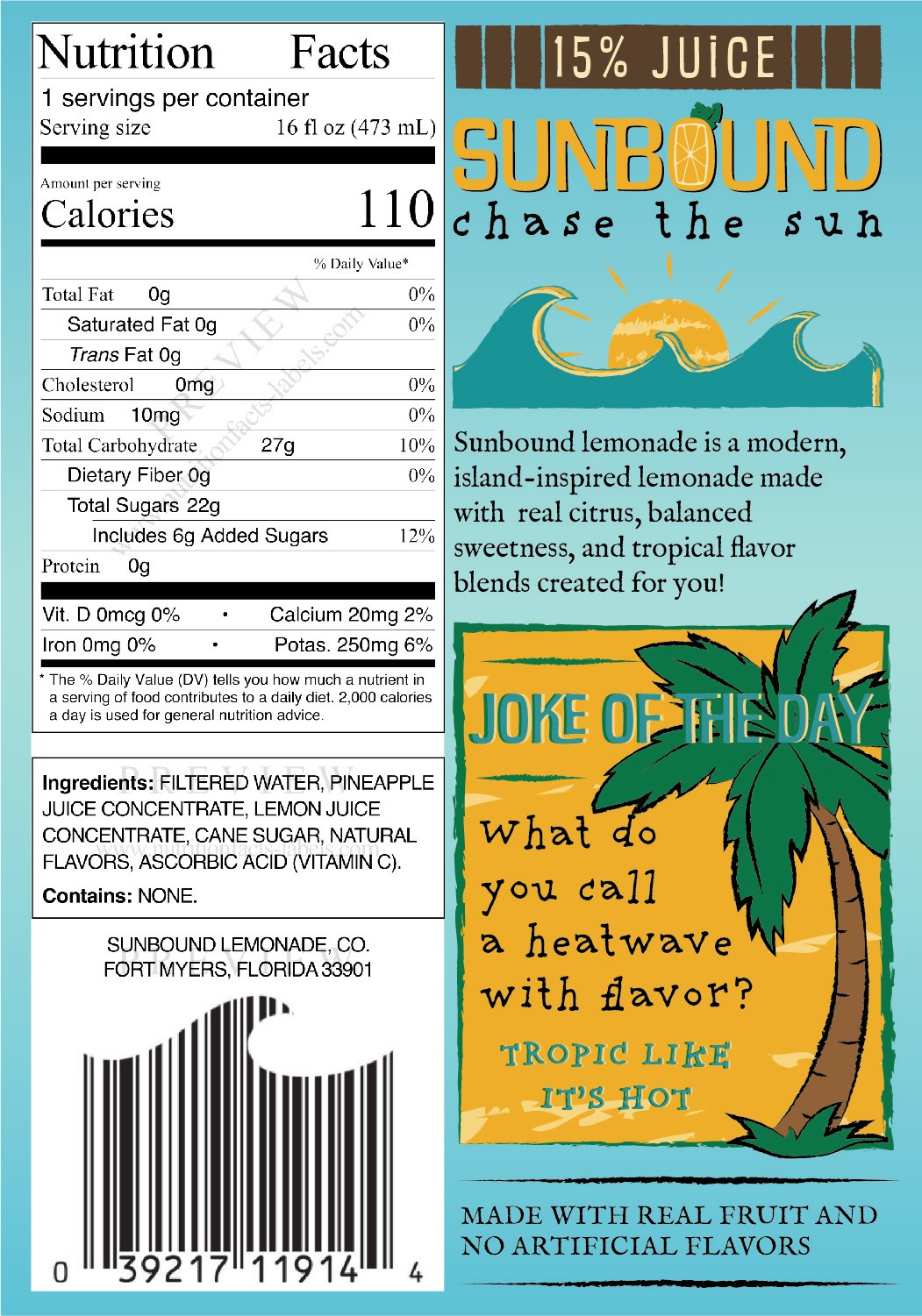
The wordmark is hand-drawn in rounded capitals with an orange-slice O, over the script line “chase the sun”. Every label keeps the same architecture — wordmark, script, an arched fruit illustration, a hand-lettered flavour name, “(shake well)” and the size — and changes only the fruit. The back panels carry nutrition facts, a two-line brand story and a Joke of the Day, so the pack has a voice as well as the legal copy.
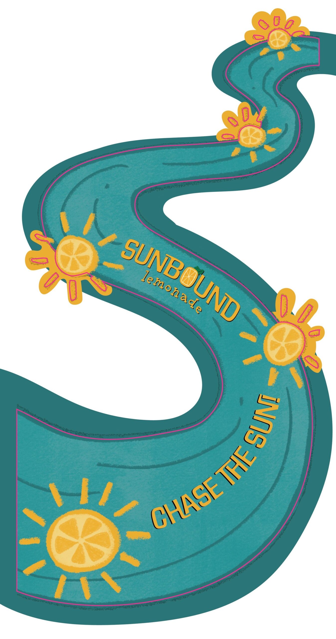
A pale-blue field, warm yellow, teal and hand-drawn palms carry from the labels to the Chase the Sun poster, the S-shaped floor decal and the counter display.
Labels
Three flavour fronts on one structure, and the back panels that give each bottle a joke.
Coconut Coast
Pineapple Breeze
Mango Sunshine
Back panel
Back panel
Back panel
In store
Window display
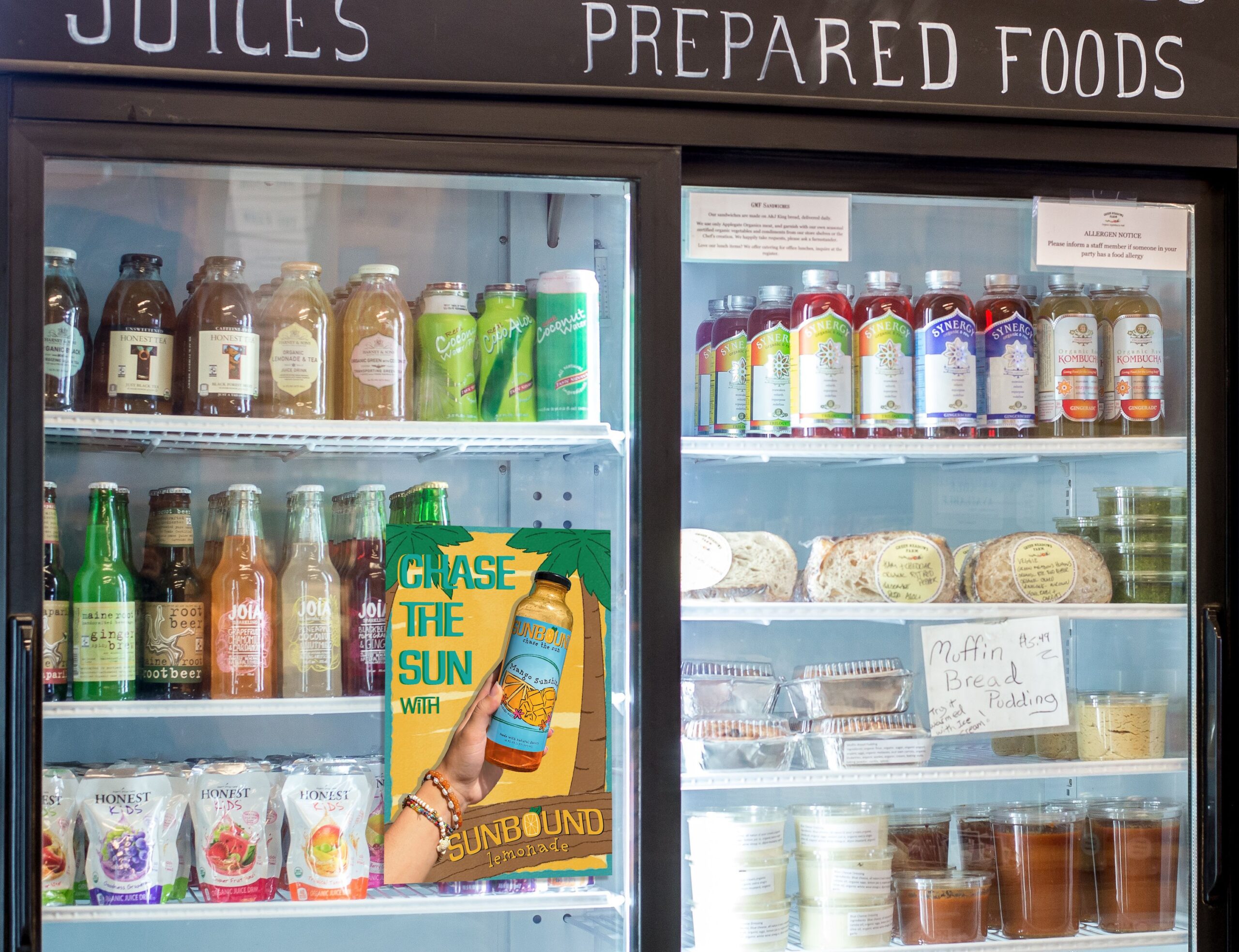
Floor decal
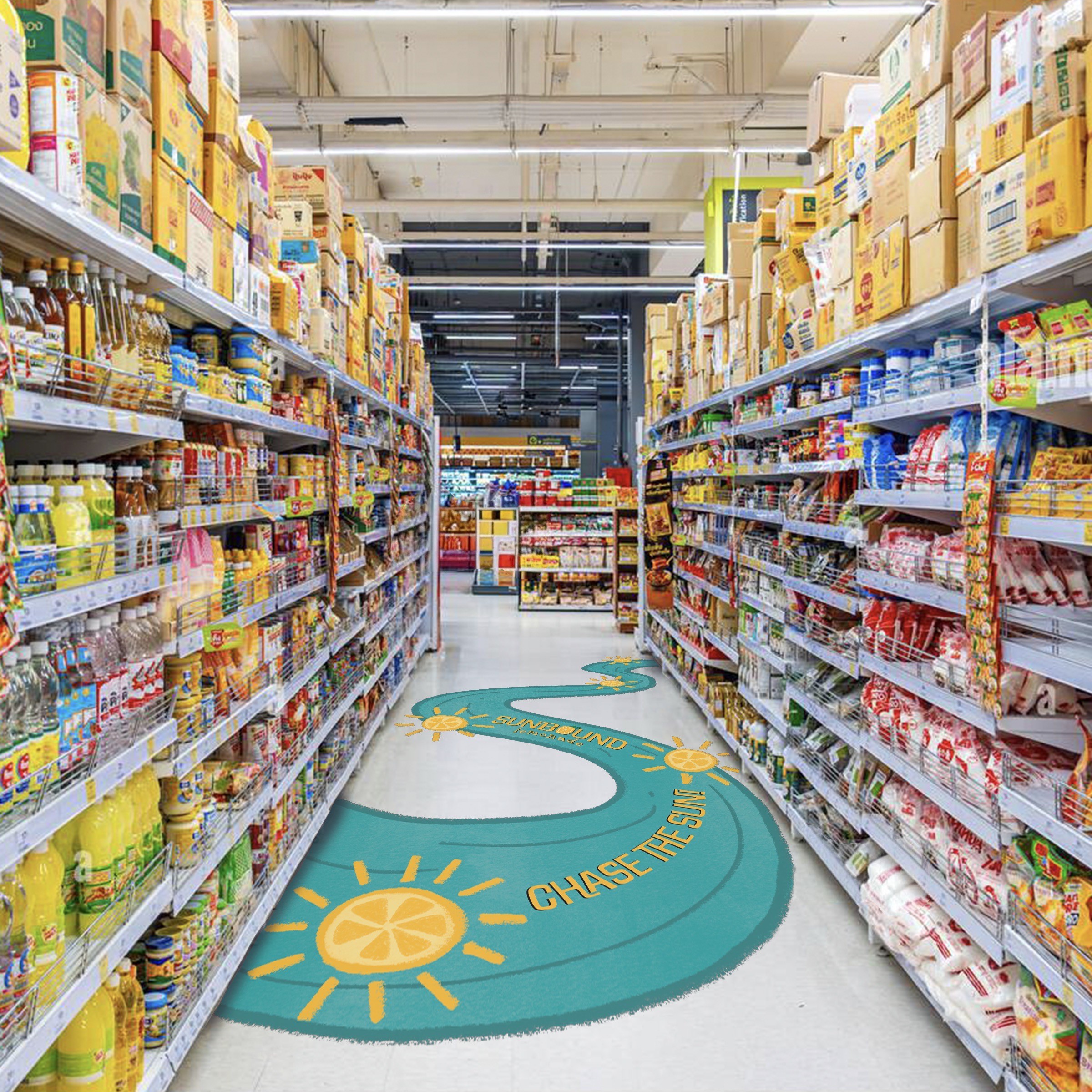
Floor decal & counter display
Floor decal artwork
Counter display
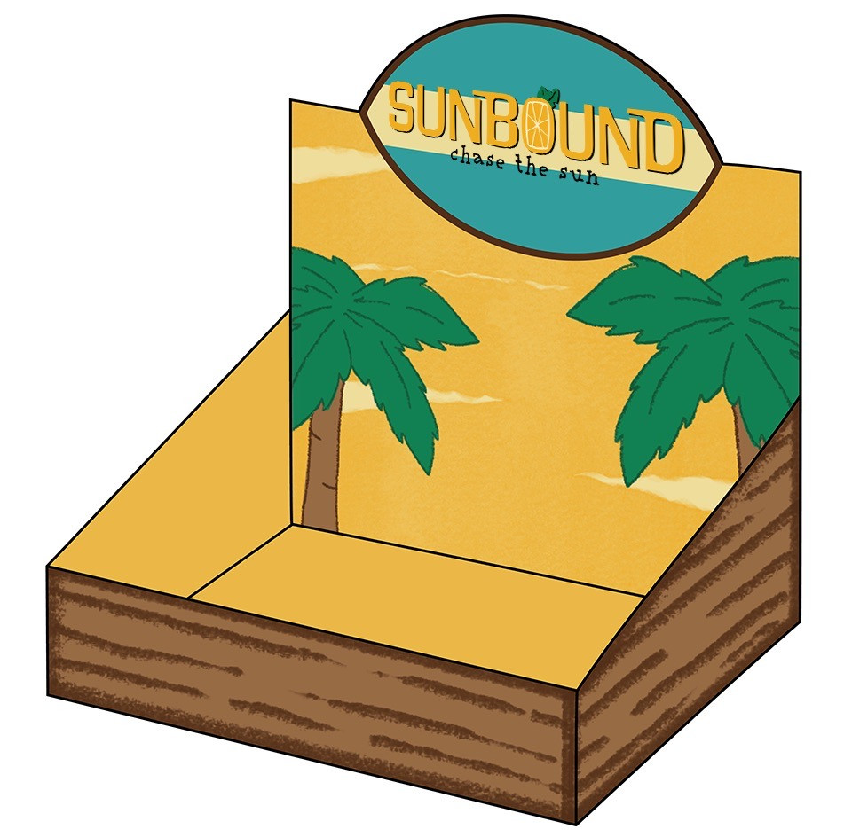
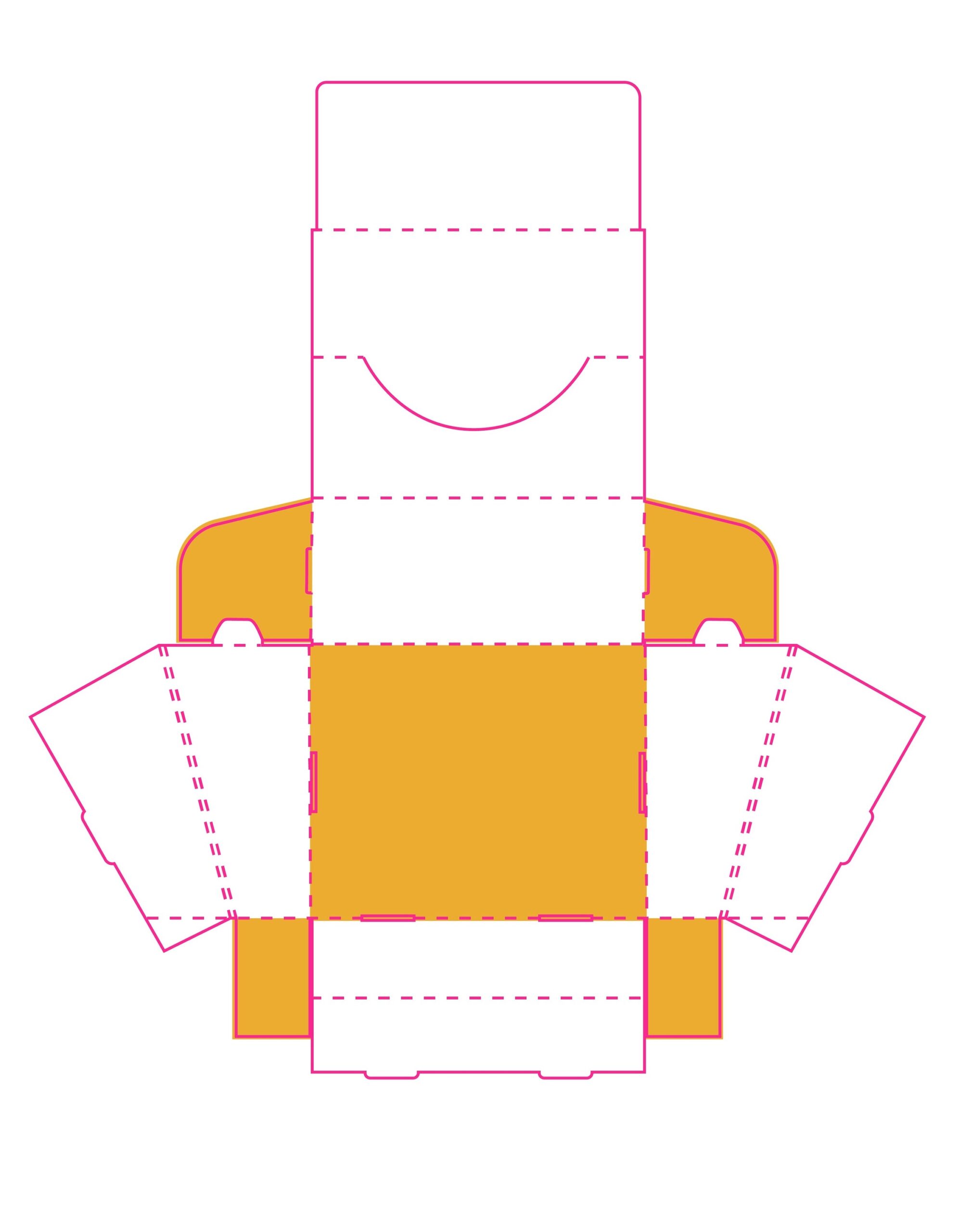
Dieline with artwork
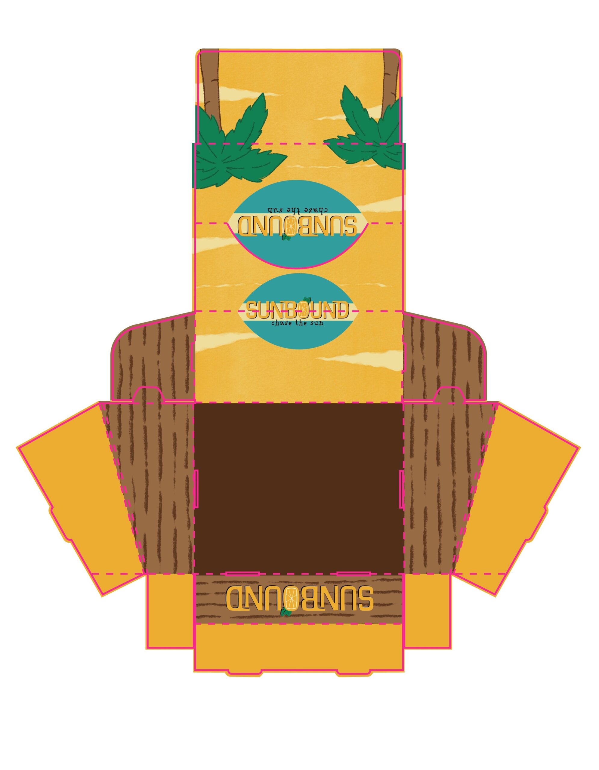
Dieline