AURÉA Monaco
Beverage Brand Identity
Opening piece
Poster
- Role
- Concept, naming, wordmark, label system, colour palette, bottle renders and environmental mockups
- Disciplines
- Identity, packaging, colour system, environmental advertising
- Deliverables
- Wordmark · three labels · bottle renders · poster and banners · environmental advertising mockups
The brief
Choose a country you have no fluency in, create a beverage brand and label, then marketing materials as if the brand were made and marketed there. Gabriella chose Monaco and built a drink around the country's high-end lifestyle.
The concept
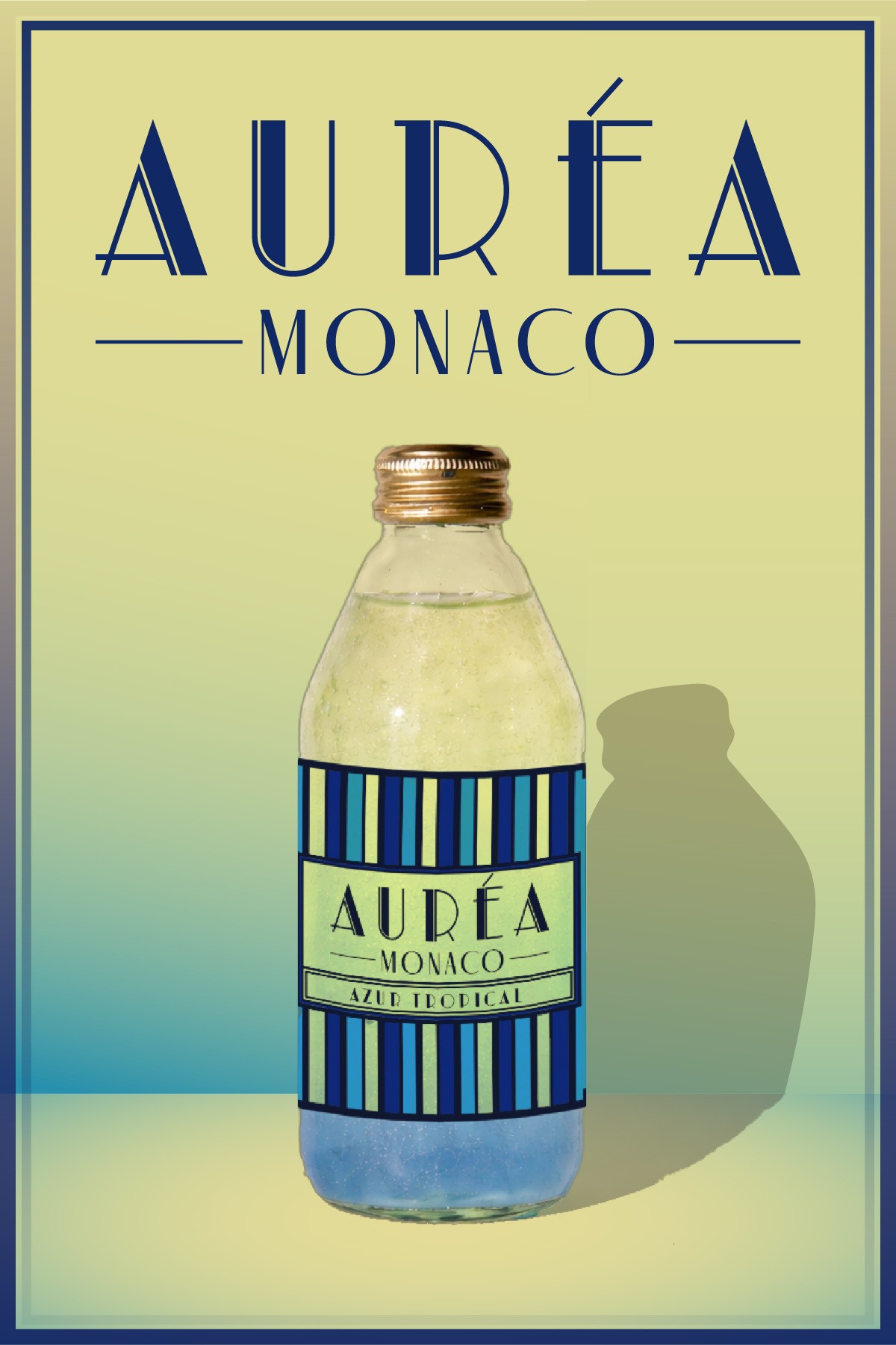
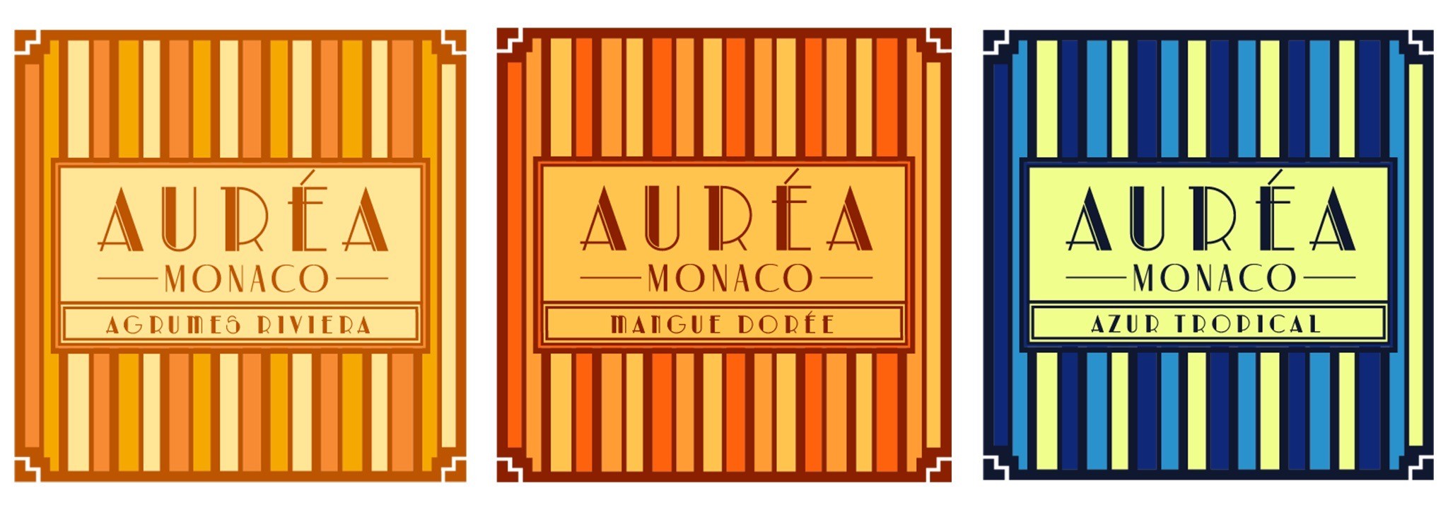
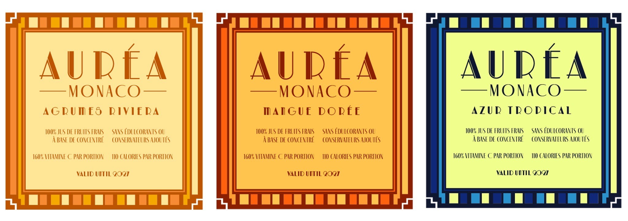
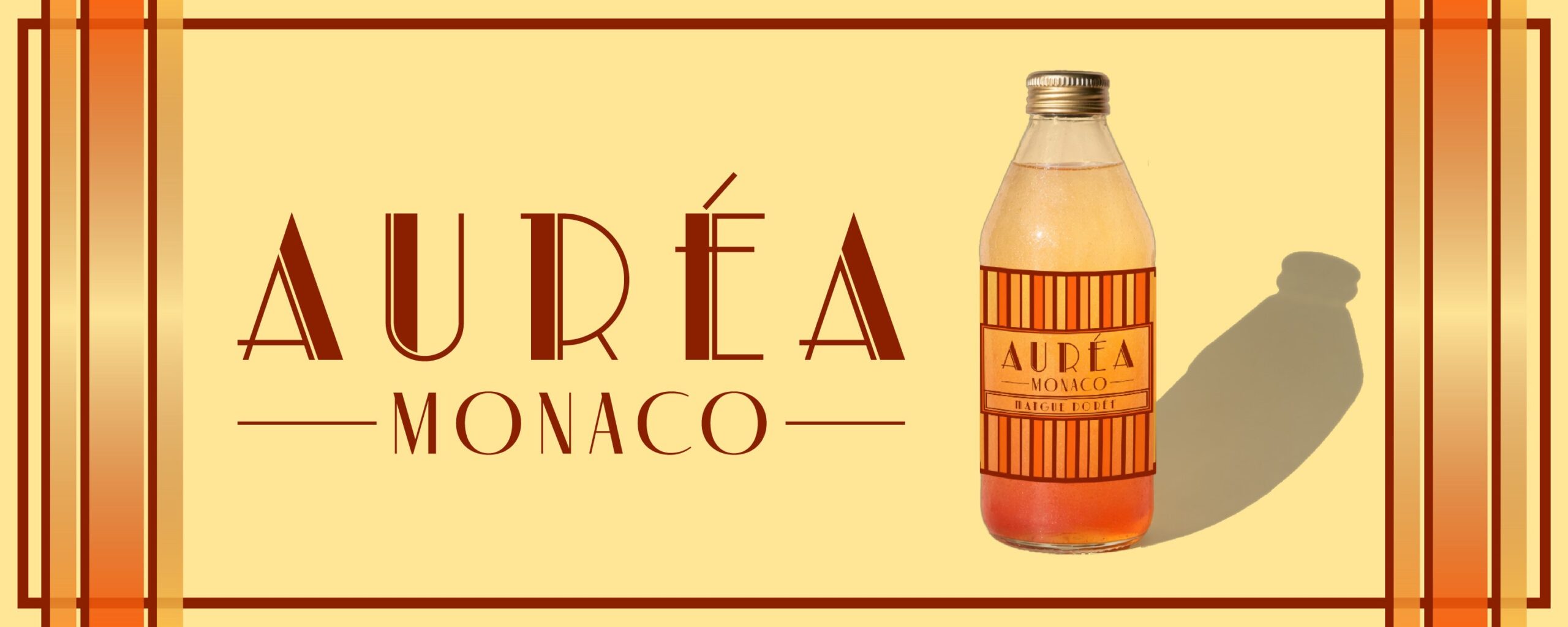
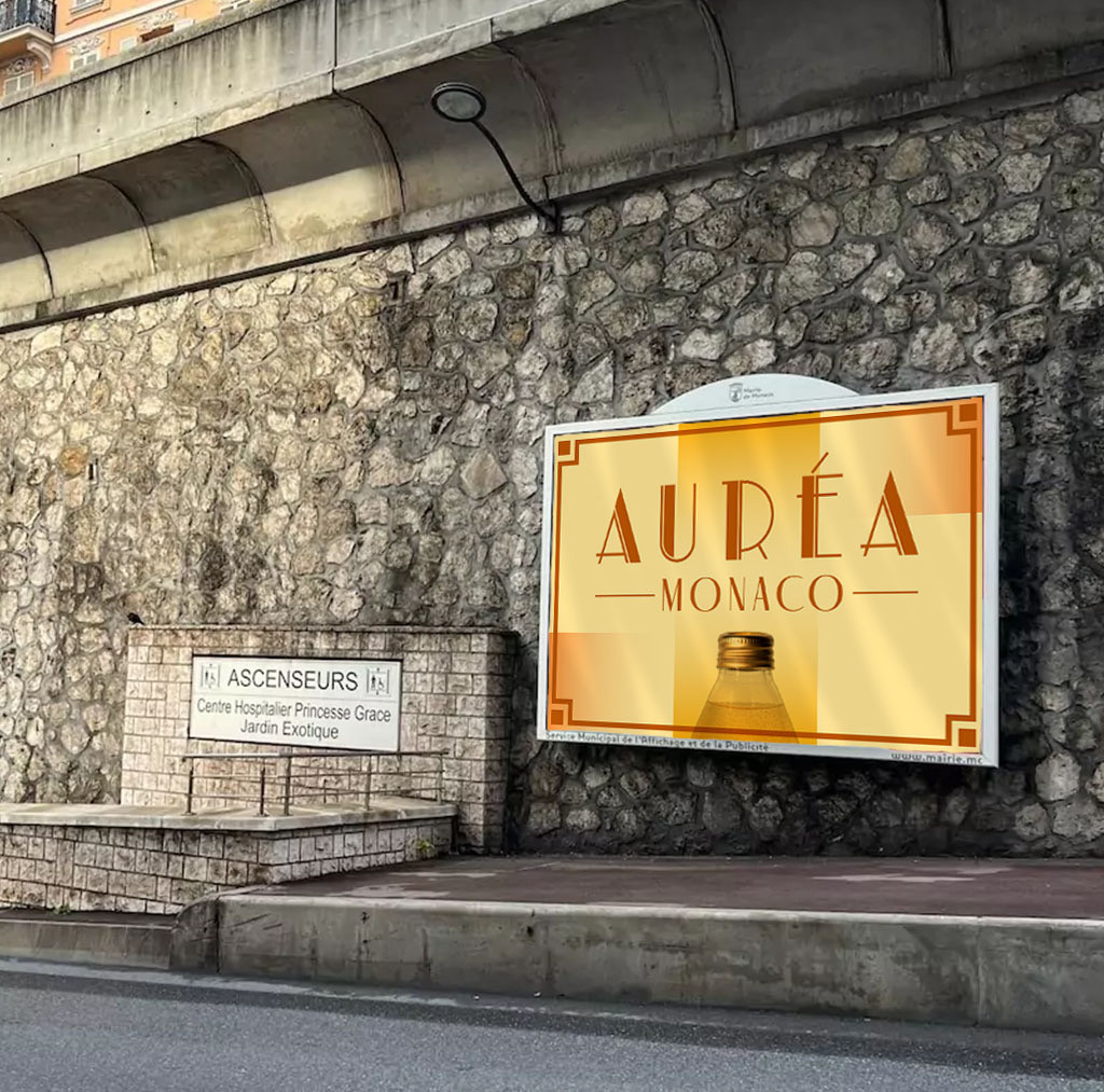
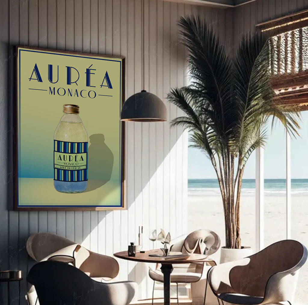
An Art Deco wordmark with stepped letterforms anchors the identity. Three label variants — Agrumes Riviera, Mangue Dorée and Azur Tropical — share a vertical stripe structure and change only palette and flavour name. The same frame carries from label to poster, banner, interior signage and trackside advertising.
The visual system
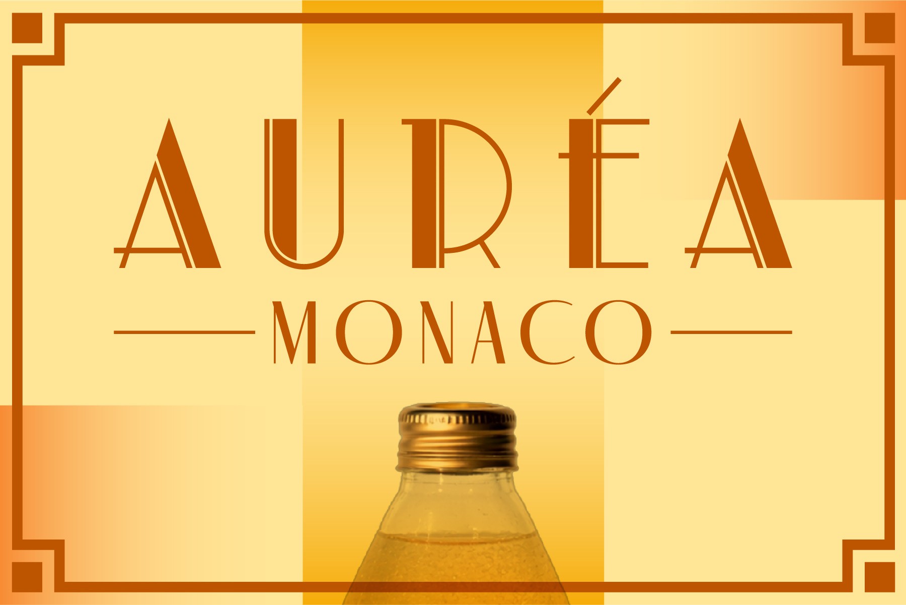
The wordmark is an Art Deco display face with stepped strokes and letterspaced capitals, locked up with MONACO between two rules. Labels are built on vertical stripes inside a bracketed deco frame; each flavour is a palette change, not a layout change.
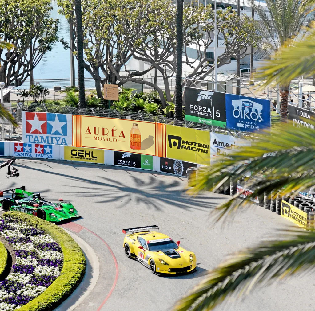
Navy, azure, gold, orange and oxblood are carried through the bottle renders, a poster set into a stone wall, a framed print in a café and trackside advertising.
Wordmark
AURÉA Monaco
Labels
Three flavours
With ingredient copy
Promotional materials
Banner
Wide banner
In place
Street poster
Café print
Trackside